Creating Custom Fields in Strapi: Advanced Guide

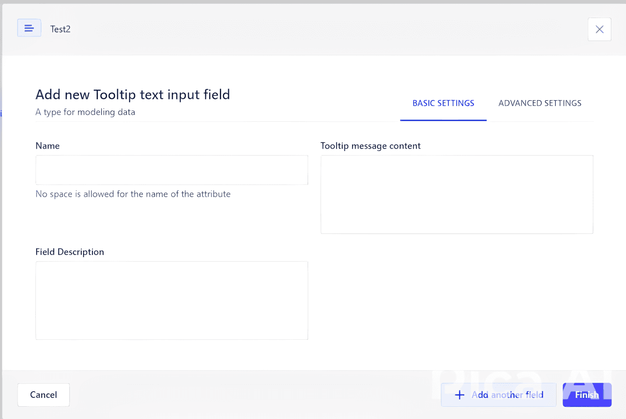
Strapi's extensibility shines with custom fields, allowing developers to create specialized input types that perfectly match project requirements. This guide walks through the process of developing custom fields for Strapi, from initial setup to advanced implementations.
Key Findings
Custom fields dramatically enhance Strapi's content editing experience by providing specialized input methods for domain-specific data types, improving both data quality and editor efficiency.
1. Custom Field Architecture
Strapi custom fields follow a plugin-like architecture with both frontend and backend components. Understanding this structure is essential for creating fields that integrate seamlessly with the admin panel.
// Directory structure for a custom field
my-custom-field/
├── admin/
│   ├── components/
│   │   └── colorPicker.jsx  // Frontend React component
├── fields/
│   │   └── colorPicker.js  // Field configuration
│   └── index.js      // Admin registration
├── server/
│   ├── register       // Server-side registration
│   │   └── index.js
│   └── index.js/    // your export file
├── package.json
└── strapi-admin.js      // admin entry point
└── strapi-server.js      // Server entry point
2. Field Configuration
The field configuration file is responsible for defining the field's properties, such as the component to use, the options, and the validation rules.
import { Discuss } from "@strapi/icons";
import pluginPk from "../../../package.json";

export default {
  name: pluginPk.name,
  pluginId: pluginPk.strapi.name,
  type: "string",
  icon: Discuss,
  intlLabel: {
    id:'{pluginPk.strapi.name}.{pluginPk.name}.field.label,
    defaultMessage: "Comment"
  },
  intlDescription: {
    id: '{pluginPk.strapi.name}.{pluginPk.name}.field.description,
    defaultMessage: "Simple comment without any input. User as private field, and only in admin itself"
  },
  options: {
    base: [
      {
        name: "options.comment",
        description: "The comment",
        defaultValue: "",
        type: "textarea",
        intlLabel: {
          id: '{pluginPk.strapi.name}.{pluginPk.name}.field.label,
          defaultMessage: "Comment"
        }
      },
      {
        name: "options.variant",
        intlLabel: {
          id:  '{pluginPk.strapi.name}.{pluginPk.name}.field.variant.label,
          defaultMessage: "Color variant"
        },
        type: "select",
        value: "success",
        defaultValue: "success",
        options: [
          {
            key: "success",
            value: "success",
            metadatas: {
              intlLabel: {
                id: '{pluginPk.strapi.name}.{pluginPk.name}.field.variant.option.success.label,
                defaultMessage: "Success"
              }
            }
          },
          {
            key: "warning",
            value: "warning",
            metadatas: {
              intlLabel: {
                id: '{pluginPk.strapi.name}.{pluginPk.name}.field.variant.option.warning.label,
                defaultMessage: "Warning"
              }
            }
          },
          {
            key: "error",
            defaultValue: "error",
            value: "error",
            metadatas: {
              intlLabel: {
                id: '{pluginPk.strapi.name}.{pluginPk.name}.field.variant.option.error.label,
                defaultMessage: "Error"
              }
            }
          }
        ],
      },
    ],
    advanced: [
      {
        sectionTitle: {
          id: 'global.settings',
          defaultMessage: 'Settings'
        },
        items: [
          {
            name: "private",
            type: "checkbox",
            defaultValue: true,
            disabled: true,
            intlLabel: {
              id:'{pluginPk.strapi.name}.{pluginPk.name}.field.private.label',
              defaultMessage: "Private Field",
            },
            intlDescription: {
              id: '{pluginPk.strapi.name}.{pluginPk.name}.field.private.description',
              defaultMessage: "This field is shown up in API response",
            }
          }
        ]
      },
    ],
  },
  components: { Input: async () => import("../../components/comment") }

}
3. Developing the Frontend Component
The frontend component handles the user interface in the Strapi admin panel. Built with React, this component should follow Strapi's design guidelines while providing specialized functionality.
import React from "react";
import { Box, Typography, DesignSystemProvider } from "@strapi/design-system";
import { Information, CrossCircle, MarkCircle } from "@strapi/icons";

const colors = {
  success: {
    background: "success200",
    Icon: Information,
    textColor: "neutral800",
  },
  warning: {
    background: "warning200",
    Icon: MarkCircle,
    textColor: "neutral800",
  },
  error: {
    background: "danger200",
    Icon: CrossCircle,
    textColor: "neutral800",
  },
};

const CommentField = React.forwardRef((props, ref) => {
  const { comment, variant } = props.attribute.options;
  const { background, textColor, Icon } = colors[variant];
  return (
    <DesignSystemProvider>
      <Box
        background={background}
        padding={4}
        style={{ borderRadius: "8px", display: "flex", alignItems: "center" }}
        ref={ref}
      >
        {Icon ? <Icon style={{ verticalAlign: "middle" }} /> : ""}
        <Typography style={{ marginLeft: ".5rem" }} textColor={textColor}>
          {comment}
        </Typography>
      </Box>
    </DesignSystemProvider>
  );
});

export default CommentField;
4. Registering the Custom Field
For Strapi to recognize your custom field, you need to register it properly. This involves creating the necessary registration files and specifying how the field should be handled.
"use strict";
import fields from "./fields";

export default {
  register(app) {
    for (const field of fields) {
      app.customFields.register(field);
    }
  },
};
5. Server Registering the Custom Field
For Strapi to recognize your custom field, you need to register it properly. This involves creating the necessary registration files and specifying how the field should be handled.
// server/register/index.js

            "use strict";

const pluginPkg = require('../../package.json');

module.exports = ({ strapi }) => {
  strapi.customFields.register({
    name: pluginPkg.name,
    plugin: pluginPkg.strapi.name,
    type: "string",
  });

  strapi.customFields.register({
    name:'tooltip-field',
    plugin: pluginPkg.strapi.name,
    type: "string",
  })

  strapi.customFields.register({
    name:'tooltip-number-field',
    plugin: 'superfields',
    type: "integer",
  })


  strapi.customFields.register({
    name:'tooltip-boolean-field',
    plugin: 'superfields',
    type: "boolean",
  })


  strapi.customFields.register({
    name:'tooltip-enum-field',
    plugin: 'superfields',
    type: "string",
  })

  strapi.customFields.register({
    name:'multi-select',
    plugin: 'superfields',
    type: "string",
  })


  strapi.customFields.register({
    name:'tooltip-datetime-field',
    plugin: 'superfields',
    type: "date",
  })


  strapi.customFields.register({
    name:'tooltip-color-picker',
    plugin: 'superfields',
    type: "string",
  })
};
6. Server Registering the Custom Field
For Strapi to recognize your custom field, you need to register it properly. This involves creating the necessary registration files and specifying how the field should be handled.
// server/register/index.js

"use strict";

const pluginPkg = require('../../package.json');

module.exports = ({ strapi }) => {
  strapi.customFields.register({
    name: pluginPkg.name,
    plugin: pluginPkg.strapi.name,
    type: "string",
  });

};
7. Exporting Registering the Custom Field
For Strapi to recognize your custom field, you need to register it properly. This involves creating the necessary registration files and specifying how the field should be handled.
// server/index.js

"use strict";

const register = require("./register");

module.exports = {
  register,
};
8. Exporting Admin and Server
//your-plugin/strapi-admin.js

"use strict";

import admin from "./admin";

export default admin;

--------------------------------------------------------------------------------------------------------------------------------------

//your-plugin/strapi-server.js

"use strict";

module.exports = require("./server");
Custom fields in Strapi represent the perfect intersection of developer flexibility and content editor experience. They allow us to create domain-specific interfaces that make content creation more intuitive and error-proof.- Maya Johnson, UX Director at ContentFirst
Implications for Professionals
This study has several important implications for professionals in the field:
- Enhanced content editing experience
- More precise data collection and validation
- Domain-specific input methods
- Reduced training time for content editors
- Better data quality and consistency
- Improved content modeling capabilities
- Custom validation rules
- Specialized visualizations for complex data
- Better integration with external services and APIs
- Clearer data representation in the admin interface
Conclusion
Custom fields significantly extend Strapi's capabilities by allowing developers to create specialized input methods tailored to their specific content requirements. By following the development patterns outlined in this guide, you can enhance your Strapi admin interface with intuitive, domain-specific fields that improve both the content editing experience and data quality. Whether you're implementing simple enhancements or complex data structures, custom fields offer the flexibility to make Strapi truly your own.